Website Layouts That Work
Many websites are starting to adopt the “magazine” look—layouts inspired by the graphically rich designs of pop magazines. Why? Because they’re learning something that magazine artists have known for ages: people are visually hungry creatures. Hundreds of street surveys have proven it: everyone reaches for the big and bold covers, while the bland black-and-whites tend to be ignored. Think of the Internet as a giant magazine rack, and your site as one of 100 million covers vying for attention.
Less is more: Avoiding content overload
The first rule is that less is always more. The term “content overload” was coined by designers to refer to sites that try to cram too much in a single page. You’ve seen the kind: too many columns, very small text, and images reduced to a few smeared pixels. Often, it’s the result of a poorly planned attempt to reduce file size and give users one-click access to all the site’s features. But what it really says is that your business is muddled, disorganized, and not really worth anyone’s time.
The Block Layout

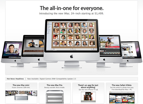
A new trend that’s worth looking into is the block layout, which divides the page into blocks rather than columns. Apple makes good use of this technique: they’ve got a main block showing off their newest gadgets, and smaller blocks for older products (like the Mac mini) that are still in the market. Just like the sneak peeks on a magazine cover, the Apple homepage uses blocks to cover more ground without going overboard.
Keep things moving
Finally, you’ll need to take into account that web design trends change much faster than they do in print. Web design is never a once-off affair; you have to keep up with the changing tastes of the web community. That’s why the first rule of good design is to never keep things still. By adopting layouts that appeal to the fickle Internet market, you’ll keep your audience longer and build a more solid customer base.


