Infographics for the Web
One thing that sets Web communication apart from print is the shortened attention span of its readers. Anyone with the patience to pick up the paper most likely has the patience to read through one article. But on the web, your readers are practically swimming in a sea of distractions: checking their Facebook, watching videos, pressing the back button.
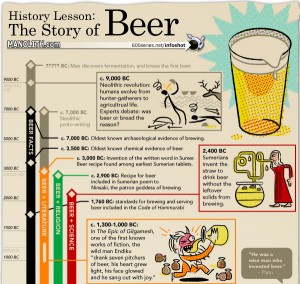
That’s why infographics—images designed to convey information—are as vital to online business as the website itself. On the Web, words alone aren’t enough. What infographics do is compress your words into a reader-friendly format that can be viewed at a glance. In a way, it makes reading your article optional—people can take a quick look at your infographic and walk away just as informed.
So what makes a good infographic? Designers agree on four factors:

1. Rigor.
Good infographics are the work of both the designer and the writer or editor. Many amateurs get straight to work without reading the source material, throwing in only as much as they know. But that defeats the purpose. Start by determining the key points of your content, and work them accordingly into your graphic.
2. Comparison.
Not everyone has a good sense of distance, so “10 miles across” doesn’t communicate a whole lot. Infographics work much better when there’s a point of comparison. Use familiar images as your benchmarks. Use five adjacent football fields to emphasize the size of a city, or put two subjects side by side to illustrate a height difference.

3. Direction.
Arrows are a vital part of many infographics, but they can get tricky. Many designers make the mistake of using them for emphasis (like red arrows pointing to a brand new car). Experts advise against using them for anything other than moving direction.
4. Color.
Infographics are meant to catch the eye and get people reading, so it needs to pop out of the page. Colors convey the mood of the story. That’s why graphics for travel and sailing are often in blue, and environmental pieces are often supplemented in green. Black-and-white infographics rarely work, although for compatibility’s sake, you do have to choose colors that would play out well in grayscale.


