Web Design Trends for 2009
Artists have called web design the most erratic of creative pursuits, and for the most part, they’re right. While music trends last at least a couple of years, and art movements at least a few decades, web design can change its course in a matter of months. So if you’re still sporting last year’s designs, chances are you’ve already slipped from cutting edge to the age of dinosaurs. Smashing Magazine has come up with a lengthy list of design elements set to dominate 2009, and we’ve picked those that are likely to stay.

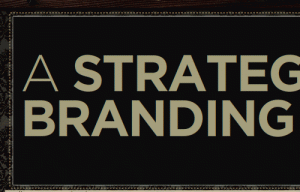
Large type
On the Web, large type often refers to texts of at least 36 pixels, or half an inch. Today’s designers have blown up their words to about 72, sometimes even more. It’s partly because screens are getting larger, but also because Web readers are more fickle than ever. Use large type to emphasize titles or highlight important parts of your copy.

Even larger pictures
If your site is more image-based than text-based, try supplementing your text with equally large imagery. Many successful websites use mascots—an illustrated character that guides the user through the site—and at the same time build a more solid corporate identity. If interested, the screen-shot located to the right is from MailChimp: a great online email marketing software.

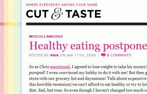
The magazine look
Many websites are going back to their roots and adapting techniques traditionally used in print. Kickers (expanded titles or taglines) are showing up on blogs and newsletters, and photos now often come with captions. People seem to prefer the magazine look because it’s more intuitive and deviates from the no-frills look of most corporate sites.

Blocks and columns
This style is seen everywhere from news websites to artist blogs. Basically, you break up a row into three or more “blocks” each featuring a different type of content. One block may link to your corporate history, another to your product list, and another to the contact page. Use this style for sections that need to stand out, such as a sales page.

Social icons
You’d be hard pressed these days to find a blog that doesn’t have a Twitter feed or a Flickr slideshow. These are all effective ways to promote your content, but more importantly, they add a human face to your company. Readers like to know that behind all that business talk, you’re still on Facebook like everyone else.


